No one understands your heart. No one understands your words. No one understands your actions. But people think they understand your photographs.
The day:
Bus into the Flower show: Three women my age from outside London came and sat next to me on the bus and started talking to me and joking around with me. Proving that everyone outside of London is still friendly.
Walking around the place where they were selling all the flowers. An inspiring experience. People kept on complimenting me on my clothes – it was at least twenty people, mostly women. And the women gardeners all approached me and talked to me themselves. Women kept on talking to me all day.
However, I had work to do (and what was I going to do talking to women that live outside of London?). It was a case of mixing pleasure with business. Or, rather, pleasure with pleasure. Because my obsession is writing. I went to all of the art stores because I write for a website about plant art. So I collected lots of contacts and got permission to use their artwork for the site. There is a huge amount of stuff to get through.
I skipped lunch. I thought I could treat myself on my holiday to an expensive lunch. I am not used to luxury when that money could be used for something useful. I stayed hungry the whole day and survived off two chocolate bars and water (two Lindt chocolate bars for £1.80).
Hampton Court Palace Gardens towards the end before one final push to get some good photographs inside again.
I went on the Ferry back to the station to get a boat ride in. There was some miscommunication about a buoy a boat had ran into – a young girl thought it was a boy and not a buoy which everyone found amusing.
I walked into town afterwards to look around and went into a last art gallery with a daughter and father duo of artists. He was a carver, she was a painter. I got permission from her to use her work and to write about it for the website.
I was going to go straight home and eat but I ended up helping a sick person on the tube that was throwing up in the bins. It is my duty to help people – the philosophy of the religion I was raised in. No one else was helping him and he needed help. I ran to get someone even though they took their time to walk to him and get him assistance. I had to stay with him for a while.
Which meant that I ended up eating a take out in London before I went home.
Incredibly, for a country associated with everything that is hi-tech, Japan does not have its own museum of design. At Japan House, the Design Discoveries exhibition puts together seven major designers to consider what they would contribute in the form of design treasures to such a museum. We get a chance to see the rich diversity of Japanese design and some of the unique and inspirational design stories in the land of the rising sun.
I went to this exhibition after my first visit to the Design Museum here in London. I realised that I needed to learn more about this subject, design. Design is all around us. I often wonder to myself if I can ever extract myself from everything that is human made and see real wilderness. The reality is that everything around us – especially in London – is designed. Even when you are in the parks, the parks have been sculpted to look like what they look like. And this exhibition was an illuminating look into the nature of design creativity, how it depends on a historical and geographic context and a rich history of tradition.
Here are the design treasures and my personal comments on each of the exhibitions:
Haburagin, the Clothing of the Noro Priestesses: Design to Protect the Wearer by Morinaga Kunihiko, Fashion Designer
Worn over 500 years ago, these garments enable spiritual safety for the wearer and the community. The stitching keeps out evil spirits. This exhibit was particularly fascinating. Because protection is what coordinates, what is at the basis of our human relationships. I was talking about this with one my best friends. Women want a man that protects them. Men want a woman that gives them protection from the world. Protection is the basic need of humankind. And, I am named after protection: Sunil Dutt who saved the actress Nargis from the fire that broke out on the set of the film ‘Mother India’, a film itself made to protect the honour of India from attacks from the West.
The spirituality of fashion design, fashion built for a community and its spiritual needs was an insight into a world where clothes are not about looking good, but which protect the mind and the self. A psychology of safety that you wear to enable mental functioning and health.
But what is sad about this garments is the reality behind the design: that sometimes the evil spirits creep in and then you no longer have protection.
The premise behind this design may seem archaic, but it continues into the present. I am partially Hindu and my background is that we pray to the Mother Goddess, the warrior, to protect us. And I wear a bracelet on my hand of Bastet with her cats, because she protects and brings good health.
This design is a treasure because it shows that what is important to humans from a design point of view is the fulfilment of of deep-rooted psychological needs such as security and wellbeing, mental health.
Whip Tops and Tops Inspired by Them: Toys as Our First Contact with Design by Tsujikawa Koichiro, Film Director
Here’s what the exhibition notes say:
‘Toys nurture the five senses and the child’s primal desires to touch, see and hear. They embody design in its most primitive form’.
There is a mystical property to the spinning tops because their motion mirrors the human life cycle. They remind us of death when they stop spinning.
What intrigued me about the spinning tops exhibition in terms of design is how rich, colourful and beautiful design is when adults are designing things for children. Because then, the love for design becomes one with the love of children. Adults are trying to initiate children into the world of the human imagination and they present everything that is best about it. And, the conscientious adult – like the designer of these spinning tops – does not stint with knowledge and the experience of life. The design that is made for children is to educate them into the passage and the meanings of life, each of its different stages. It is the greatest moment of sharing in culture: when you are trying to mould the mind of the inexperienced through your own experience. This is why these spinning tops – and design for children – is always so beautiful. The meaning of our human existence is to share our knowledge, our appreciation of beauty, our experience with the future and the next generation.
Jōmon Village Design: Design Found in 10,000-year-old Living Spaces by Tane Tsuyoshi, Architect
‘The Jōmon people designed based on a ring system. The structure of village society was a ring. For 800 years, others joined this ring and belonged to the ring’.
‘Houses were arranged in a circle with the entrances facing the centre. At the centre, there was a ring of stones. This central ring was a place where the living paid their respects to and mourned the dead’.
In my view, the elemental social unit of gathering and community is the ring. With the discovery of fire, the original human group would have ranged themselves in a circle around the fire. This is the only way of maximising the warmth of the flames. This ring design of the Jōmon people embodies the basic unit of organisation.
In our society, where there is no longer eye contact, much face to face interaction, where we sit or stand for hours by ourselves in an unnatural state of affairs, the ring stands for community, integration, oneness. It is a beautiful ideal that we have lost: that connection of human to human that is the secret longing of every heart that dreams for something better than what we have now.
This design is a treasure because it speaks to a fundamental human need for connection and community. It is a reminder of what we have lost in the modern age.
State-of-the-Art 3D Sportswear: Inspired by a Lantern Festival in Toyama by Sudō Reiko, Textile Designer
Before computers, there were humans. And what humans have, compared to a computer, are traditions, spirituality and the brilliance and resourcefulness of their brains. Culture.
Before computer-aided design, there was the festival where the designer made bamboo frames which transformed two dimensional drawings into three dimensional lanterns. And it was because of that that he was able to make three dimensional garments such as 3D-cut woven skiwear in the 1970s..
This design story resonated with me deeply because it shows the resourcefulness of creativity, the inspiration from tradition that prompts innovation. Creativity can be at its best when you are importing or transferring one design tradition into an innovation for another problem.
And, myself, I find constant inspiration from religion. When I was a child, my mother got me, out of everyone, to take the incense and burn it before the mother goddess, the warrior, in the prayer rituals of the house. Bowing my head and holding my hands joined together before her. We asked for her protection. And that moment comes backs to me over and over again and it has become one of the powerful inspirations for creativity and life. The work for the goddess, the work for the festival, the work for the people.
A design treasure because love is work and work is love.
When I did my PhD and then got my doctorate published as a monograph, I showed that, just after the invention of photography, Victorian authors associated photography with women and a challenge to the patriarchy and its law. Because of this, throughout the novels of Thomas Hardy, Charles Dickens, Henry James and Wilkie Collins, photography was belittled and there was an attempt to exorcise it from the text. They associated photography with a woman’s supposedly superficial and legally ignorant gaze in The Moonstone (alongside the Indian gaze of the Idolater). The reason was because photography was used to photograph the body and women were seen as bodies rather than minds. Therefore, the denigration of photography was the denigration of the body in Judaeo Christian culture and the repressed times of the Victorians. The most obvious equation of photography with women and their bodies is in She, where Ayesha, the epitome of feminine beauty and physical attractiveness is able to make telepathic mental photographs of the male heroes through her surveillance in her feminine empire and as an expression of her womanly power.
It was the feminine body of photography that was thought of as such a challenge to the male body of the law in these novels that I studied. A usurper to the throne. The medium of revolution.
Almost two hundred years after that equation of the photographic with women, I walked into a feminist protest through the means of photography at the South London Gallery. It was an exhibition space where women were fighting against injustice, state regimes and the law, like the laws controlling abortion. These women were trying to extend the meaning of protest photography. It was a fight of the truth of women against the ideology of the patriarchal state.
The exhibition label calls this ‘the fourth wave’ of feminist protest which is about the empowerment of women, uses internet tools and includes factors such as intersectionality, where there are overlapping oppressions such as misogyny, race and class (Wikipedia). The exhibition is organised in four different sections:
– Body as Battleground
– Institutional Failure
– Revising Histories
– Feminist Futures
Here, in this review, I am going to consider the photography that I had a particular interest in.
Sofia Karim, Ihtijaj (Resistance) (Delhi, 2019)
This photograph is part of a series against anti-Muslim citizenship laws in India which have gone against the ideals of cosmopolitanism and acceptance that Indian descent people like me have grown up on. The title of the series is Turbine Bagh, which is a woman’s resistance movement intended to go against the oppressive laws. The image is printed on a samosa packet made out of newspaper – Sofia was served a samosa packet with court hearings on it once. The image is something that is being fed to the recipient of the law, of news. It is food, nourishment. For the women’s resistance movement.
What strikes me in this black and white photograph is the relationship between the active body of the woman holding her hand above her head to make a gesture and the seemingly passive bodies of the other seated women around her. This is what is apparent at first sight: the movement towards resistance, the action. The active woman’s mouth is forming words. She is communicating, acting. She is energy in the face of passivity. And you look closely to the woman in the right that creates a relationship to this action – her hands are clasped in seeming prayer. The resistance is the prayer of the people, of women. The active woman is the heroine that they are praying for to overturn the injustice of the modern day state. And then, the passivity of the other seated women becomes something else. It is the gesture of waiting. Patient waiting. For the revolution. For the fire that burns and sears the world.
The humble samosa packet which contains the greatness of the revolution.
Hoda Afshar, In Turn (2023)
Tehran’s ‘morality police’ killed twenty-two year old Mahsa Amini for not wearing the hijab under government standards. These photographs are one with the protest against that legally sanctioned murder of a woman’s freedom and choice over her body.
The photographs are staged images that utilise the imagery of the doves, birds that are released at the funerals of those that have lost their lives in the protest. The birds stand for martyrdom and peace.
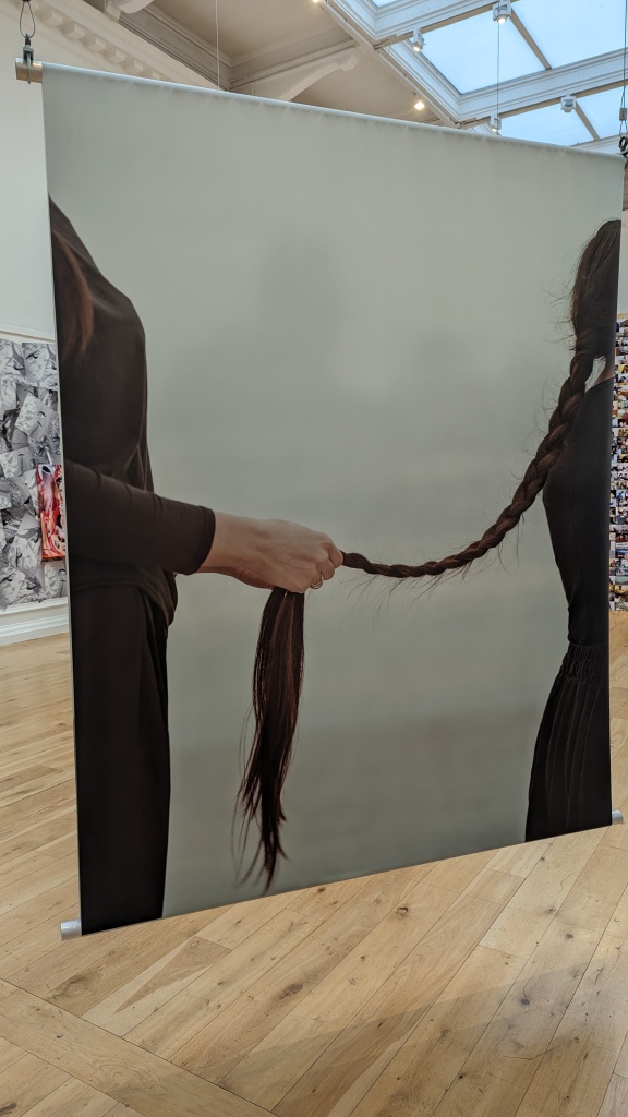
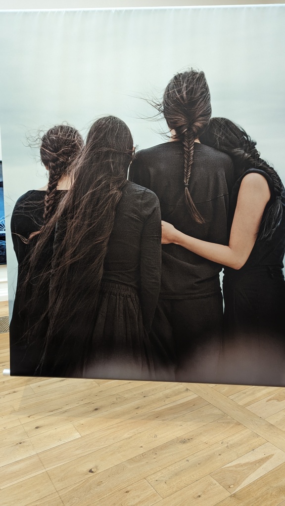
The women in the photographs are largely anonymous because anonymity protects the protesters on social media. These protest photographs show women plaiting each other’s hair and discarding their veils. The hair is plaited as respect is given to women freedom fighters fighting in Kurdistan against the Islamic state. They plait their hair before battle.
These monumental photographs are impressive and powerful. They give a body to the protesters and, with it, humanity. A community is formed around hair and the freedom to show it. The large format itself is a celebration of women and female bodily display, the ‘exposure’ that photography gives. Because, despite the fact that most of the models are anonymous, in the final images as we walk through the space, as you journey through the images and the story they are telling, you see the full frontal body of the woman with doves and her face is completely visible. And on the reverse, you can see the profile of a woman that braids the hair.
The plaited black hair of warfare and the white doves of peace tell a story. To have peace, you have to have the war first. Peace is the aim that can only be achieved through fighting for the rights to have choice and freedom. In the final photograph, a pair of hands braids the hair Another pair of hands superimposed on the back of the woman whose hair is being plaited holds the dove of peace and martyrdom. A reminder that freedom costs something. The fight.
These photographs are an inspiring celebration of heroism.
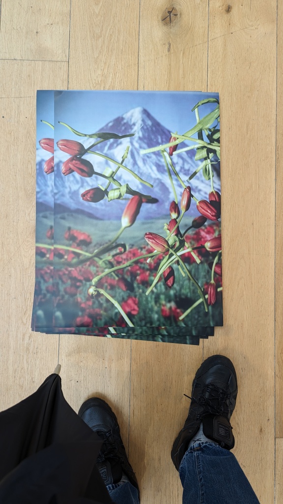
Sheida Soleimani, ‘Tulip Poster’ from the Series To Oblivion (2016)
This poster is a tribute to the Iranian women unjustly imprisoned and killed by the state. The tulips reference an Iranian revolutionary song that sees the flower as revolutionary hope – because although it is fragile, it is resilient and it regrows every spring. The numbers on the back of the poster show current published data of those arrested and killed by the Iranian state.
The redness of the flowers. Blood. Against the mountain in the background. With their stalks, the tulips are the ladders up to the peak. They are the scaffolding that can even go above the peak. To ascend the ladders, you have to have the revolutionary hope. Which no sword can cut down. Which no gun can diminish. The tulips are the beauty of hope. The beauty of the revolution. They transcend death with their growth. They have the beauty of growth, nature, resilience. To ascend the ladder of hope is the ascent into heaven. In the religious context of the photographer’s background, this is the image of faith in the revolution and eternal justice. Like Antigone, the photographer promotes the eternal laws of justice rather than the man-made laws of the earth.
Wendy Red Star, Amni (Echo) (2021)
This is a tribute to the matrilineal clan membership of the Appsalooke Nation which was erased by colonialism and its patriarchal laws. The artwork gives power back to the women in her family (the photographer who is Wendy Red Star, her daughter and her great-great-grandmother). And the power back to the names of the women of the Nation.
This was one of the most moving of the artworks in the exhibition for me. They called them Indians when they are Native Americans. They took their land and tried to destroy their culture and their people. They are us. We also have clan membership through our mother – Mother India is our mother and the religion of my mother is the Mother Goddess. It is this which the patriarchal, colonising state wishes to destroy and, with it, difference.
The names of power call out in the background, behind the photographic sculptures. And the photographs themselves build power. Out of the small photograph at the base, a greater entity is formed through the use of overlapping photographs. If you look carefully, you see that the aura is extended into the names of power behind, with the use of negative white space.
One of the ideas around photography when it first came into widespread use was that it could take away the soul of the sitter. Here, that idea is reversed through resistance against the patriarchy.
Because the photograph of the great-great-grandmother is there and the different generations, the photograph scultptures build up the matrilineal history which the law and the colonising state wanted to end. In the face of erasure, we have the form that has come back to us, become literalised in word and image. The phoenix has emerged from the flame.
…
The exhibition included many other pieces worth a careful examination and study. My overall impression of this exhibition is that I learnt a lot from it and I was inspired by it. We, our community, we also fight the wars against the patriarchal state and its patriarchal laws. For our way of life. For our culture. The patriarchal law wishes to kill what we are. We, the ethnic minorities, even if we are the men, we are also the women.
And the photographs showed the resistance can take many different forms. There are many dances to learn. Many songs to sing.
Time and time again, the photographs exposed what the patriarchal law of the state is. And why it has to be fought against. Not just in ‘other countries’. In Western type countries like Australia and Poland.
Sometimes, I was disappointed. One video installation said to become a ‘peaceful warrior’ and not ‘an angry warrior’. I don’t believe we should spit out our anger. But the philosophy of India is that everyone has their own path. Who are we to judge? As long as the warrior remains the warrior. That is the point.
The union of women with photography suggested calamity to the male Victorian authors that I studied. It suggested the revolution. The exhibit of feminist protest photography is the natural outcome of the resistance. As a form of truth which exposures the corrupt heart of power, photography has few rivals. These images demand more attention and more thought. Within them, they contain the resistance to the state structure and the patriarchal law. And, within them, they contain the conception of justice that the patriarchal law does not have, with its false claims to universality, timelessness and ‘truth’. By making photography concrete, by giving it the female body, these photographers have fought against the male body of the law with its male subject. They have created women’s – and photography’s – jurisprudence in the present moment.
In the end, the warrior loves the warrior. The exhibition is warrior culture.
Review by Dr. Suneel Mehmi on 19.05.2024. (Suneel’s original artwork from 2016).
This is my personal view of the exhibition and does not reflect the view or any consensus at any of the places I work at or volunteer.
For a very long time, Ezen Foundation featured a breath-taking wedding kimono decorated with cranes in its exhibition space. I was absolutely entranced by this wonderful construction of textile and art. I would take a careful look at the kimono every time I went to the gallery. For me, the kimono stood for everything that was beautiful about not just Japanese, but Asian culture. For the kimono was red, like the wedding dress of an Indian woman. The textiles were magical, shiny, seductive, splendid. They spelt out love.
My family comes from those involved in the clothing trade in India and in Britain. My mother’s side are leather merchants. My grandfather’s side were shoe makers. My grandmother worked in textiles when she was invited into this country. My mother made her own Punjabi suits when I was growing up on the sewing machine at home from the sumptuous fabrics she bought from the Indian shops. It has always been interesting to me to look at clothes and, when my grandmother passed away, I am reminded of her through the beautiful clothes that I see around me. She made me shirts and jumpers when I was a child and even when I was an adult. So when I look at these kimonos, I think of my grandmother and my mother, even if they have been made by men. That is the memory
Familiar to even the farthest flung nooks and crannies of the globe, the kimono is synonymous with Japanese culture and style. This exhibition at Ezen Foundation aims to showcase the clothing’s remarkable evolution in the latter half of the nineteenth century alongside the country’s ‘cultural and artistic transformation’.
Print to Pattern displays over 20 antique woodblock prints from kimono pattern books primarily dating from the late 19th century, also known as the Meiji era. The pattern books are fashion catalogues which were used in a multitude of ways by a diverse range of audiences and which feature designs for kimonos, patterns and motifs. The exhibition comes in the form of pictures, curator labels and then QR codes which give us more information about the exhibits.
The exhibition begins by featuring kimono designs of trees and their blossoms as auspicious motifs. A tree loving country is how we know Japan. From the bonsai tree collector Mr Miyagi in The Karate Kid to the equation of everything Japanese with the cherry blossoms, that is how we have imagined and known Japan in the West. We are told how the trees form symbols and meanings, how humans are relating to the natural world by representing it in a system of human meaning. We form the idea of the Japanese as those that communicate through nature, that style themselves through nature. That see human qualities in the plants as well as abstract qualities like transience in the cherry blossoms or adversity in white irises.
There is a sensation of magic in the air because the trees are regarded as auspicious symbols in these designs. We are seeing the aspiration of magic in the flesh, the starvation for sorcery. Magic infiltrates the picture plane, the desire for success to be accomplished, the desire for love. It is a touching human moment.
The exhibition then moves to animals that figure on kimono design such as bats and cranes. As with the natural environment in the form of trees, we find out the meanings of these auspicious creatures and how they have figured in the Japanese imagination. The case of the bats is indicative of the historical contextualisation at work in the exhibition. We learn how the bats went from representations of prosperity to representations of modernity and aspirations for economic growth and social advancement.
Objects as motifs in kimonos now make their way into the gaze. There are bobbins, threads and needles as well as sake cups. Then, there is a print showing the iconic Mount Fuji which has remained ‘a prominent theme in kimono designs’. We learn that the motif has traditionally adorned the kimonos of young boys and has stood for resilience and strength.
We then stand before a wall decorated with floral patterns. Each element repeated into an overall scheme in a sparing, minimalistic aesthetic, with the use of negative space and flat colours to highlight the Japanese emphasis on the idea that what is not there structures the space just as much as what is there.
Other exhibits include wonderfully coloured and striking, intricately designed obi belts and prints which feature women in beautiful kimonos.
Then, finally, we see how the kimono looked on the body and in the social contexts that the women carried themselves in. We are reminded that the kimono was for presenting the body, for presenting subjectivity. There has been a move from the realm of abstract design towards how these designs signified the female form, the concrete lived experience of the Japanese in time.
In my view, Print to Pattern is a good, short introduction to the Japanese aesthetic and kimono design in the Meiji period. I remember that gallery space through the inclusion of that wonderful red wedding kimono dancing with cranes and beauty. And the exhibits of kimono design are beautiful too. Textile design is itself a neglected field in Western art history and the gallery space, so I feel that the exhibit does something to remedy this injustice. With fabrics and clothing, we see how the body relates most intimately to art and the movement of the exhibition has expressed this very well, from abstract design to, concretely, women wearing the kimono designs. There is much food for thought with the arrangement and the research into the symbolism of the things we are seeing. And the exhibition stimulates our curiosity to learn more and to see more kimonos, the crystallisation of skills in cloth-making, dying, design and fashion.
Print to Pattern is organised and curated by Olivia Mieke Maria-Paulina Martha, Wojtek Doria Dernalowicz, and Kalliopi Hadjipateras.
Summary: Artwork from the African Diaspora. The website says:
”As well as surveying the presence of the Black figure in Western art history, we examine its absence – and the story of representation told through these works, as well as the social, psychological and cultural contexts in which they were produced”.
Notes:
– The title ‘The Time is Always Now’ comes from James Baldwin in the 1960s writing about the civil rights struggle.
My comment: So the aim of the exhibition is to combat racism and this is what it should be judged on – if it is giving dignity, equality and positivity to the black figure. Is it?
Overall impressions:
Goes through quite a lot of the current thinking about racism like ‘double consciousness’ when non-white people have to look at themselves through a white perspective as well as their own non-white perspective, etc. Educational for people that haven’t experienced racism and don’t really understand what it is like.
The art is presented as educational and as being completely resistant to racism. Can art be unambiguous and not contradictory like that? How easy is it to escape racism and to be free in terms of artistic vision and in your expression?
And how beautiful are the artworks? Were they captivating? Art does not have to be apolitical to be beautiful. But I wonder whether there were any pieces of great beauty in this exhibition.
The artist says this is a composited fictional character ‘which really looks at the value systems contained within portraiture and monuments’. He was supposed to be giving power and grandeur to ‘fictional everyday people’, the under-represented black people excluded from art history and classical sculpture.
My Comment: Why closed eyes? The artist says she is embracing ‘the inner world that she’s manifesting there and trying to bring clarity perhaps, to all this noise around us’.
I wrote a book about the valuation of symbolic blindness in imperialistic, racist and misogynistic Victorian Britain. When blindness stood for power. Are the eyes closed because of this association from the past? Devaluation of sight in this system of valuation as in Western culture – when for Indians it is the queen of the senses and the motor of revolution.
The statue stands right at the front of an exhibition where we are looking – a guide to how we are supposed to see the rest of the exhibition?
Composited photographs from Victorian Britain by Galton were used to isolate supposed ‘racial features’ – how distanced is this sculpture from that process of racism and essentialisation when we are talking about race and the black figure reframed?
My favourite painting in the whole exhibition. This is an intimate portrait of one of the artist’s friends and family. It is about a ‘human relationship’, not a person.
The face is caught in a mood of introspection. A thinking man. A reflection on thought and on the minds that give us our personality, that create our relationships with others. The restricted palette of pink is beautiful: textured, cloudlike, dreamy. Details make up the piece, there are no flat colours, many many colours. Complication. Nuance in technique. The enigmatic meaning of the feet – one clothed foot, one bare. The play between the spectacle of the body and the covering of the clothes, the ‘outer’ and the ‘inner’. A drip of paint falls from the black figure as it escapes into liquid from form. There is an air of insubstantiality, dissolution, as though everything is melting away.
The thoughts of this thinking man are what are highlighted by the artist in the personal relationship. So is she connected to him because he thinks? And what is the emotion here about that connection and his thinking? It is a mysterious image, a puzzle. Maybe her thoughts about him are unresolved, oscillating between definite form and the cloudiness that informs the image. An ambigious, contradictory and paradoxical image.
This is supposed to ‘dismantle’ an exclusionary Western visual representation and to subvert it. The artist is replacing the white female figures from neoclassical style paintings with black women. The artist deconstructs the western representation and removes it from the picture through cutting, etc. Then, he inserts the black figure – inclusion.
In this painting, the black serving figure for the white woman then serves the black woman instead, so the racial power disappears from the image.
The white figure disappears and becomes a black face. However, there is a sophisticated point to this image: the white figure is still providing the frame for the black face. Blackness is still being seen through the frame of whiteness. If you look carefully, one of the eyes is cut off by the outlines of the white figure that has been cut out. The black eye is limited by the white outlines that have been given to us from history. There is a tired self-awareness in this image.
The black face inside the white frame looks sad. Her own body is missing – the black body. Even her hair – with all of its power and symbolism – is not being presented. We are seeing the fragment of a black woman’s body – she still hasn’t achieved full representation. The image conveys the sadness of racism and the artist’s rendition of the black figure. It is still a work in progress, still unattained. The Time is Always Now…
What’s on the Turner Prize shortlist this year in terms of ‘Punjabi’ art? Covered with a giant white doily, a red Ford Escort vehicle is presented to us. The ‘art’ is in front of a photograph of a family with the car.
Rosie Cooper, director of Wysing Arts Centre, who sits on the judging panel, said Kaur sees the vehicle as a “representation of her dad’s first car and his migrant desires” and it “blasted snippets of uplifting pop songs referencing freedom and liberation throughout the space”.
Obviously the artist shortlisted in this country – when they are Indian – would necessarily be female. This is what ‘diversity’ means to white people when it comes to the Subcontinent – the women. Their books, their art, their cinema. It is all celebrated. Because they are heroic ‘victims’ of Indian culture to the West. Us men are to be ignored and marginalised. Because we are the ‘oppressors’ of women in this culture.
And what about this piece which white taste has valued? The big white doily is the key. It covers over the car. The migrant desire – according to the rules of white society – is to be covered over in whiteness. The white doily – the whiteness – is self-consciously patterned and artistic – it is the touch of art in the piece. Otherwise, there would just be a car and a family snapshot. The white doily – the whiteness – is what creates this exhibition as a piece of art work. It is what demonstrates ‘taste’, ‘selection’, artistic ‘discrimination’ (the pun is intended).
And what about this ‘migrant desire’ which – despite the capture of the car in the whiteness that is like a constraining net – blasts songs of freedom and liberation (laughable)? It is ideology at work. The veil of ideology covering over the vision of the car, the white veil over things for the migrant experience. Blinding the eyes and vision. Interfering. Coming between self and object, mind and reality. Art is the white veil itself. What else is? They sing of freedom. When they are the exploited. They sing of liberty. When they are constrained and bound by the white net.
The car. The phallic symbol. Red to signify status and dominance. Gross materialism. Migrant desire is couched as greed. Desire for masculinity in this patriarchal white supremacist society. Desire for control – one drives a car.
Desire for freedom – the car represents freedom. A cliched symbol of freedom the car. But this one is caught up in the net. Even the music – they blast snippets of songs about freedom. Even musically, the freedom is partial, disrupted, interrupted, punctured by purposely oppressive silence.
Do you know what the net signifies in India? The net of maya – illusion. Gross materialism. Trickery. What comes between us and the understanding of reality. The doily is perhaps maya. This white culture and its control, its limitation of freedom for the migrant. The doily becomes kitcsch art – described by several art historians as the artwork of a capitalistic, unthinking and unfeeling, philistine and totalitarian society.
Yet, there is a paradox. If I remember correctly from the Metro newspaper article that I read today about the art piece, the doily also represents the Sikh and Indian workers that worked in textiles factories in huge numbers when they first migrated here to the United Kingdom (Metro 24.04.2024). So this net of whiteness is being created by the migrants themselves. Their deference. Their blind adulation. Their willingness to be exploited. Their inability to revolt against the systems of power.
So what are the migrant desires of the Father in this image? As seen through the eyes of a Punjabi woman? Desire to criticise the wants of the Father? Or an attempt to be sympathetic to his wants?
The artist writes:
‘In this show I am having a conversation with personal histories,’ explains Kaur, ‘exploring improvisation and political mysticism as tools to reimagine tradition and inherited myths.’
But is this a re-imagination? Look at the piece again. It tries to base itself against reality as ideology – against the photograph, the representation of reality. The photograph has the Indian family in it. The base unit of Punjabi and Indian culture. The finished art exhibit has no family in it. It has a relationship merely to the Father in a patriarchal system of culture. A Father that wants to be covered in whiteness. Is this what is valued in this culture? Probably. The probability is on the side that adulates whiteness and patriarchy. The family is forgotten in favour of the Master. In favour of isolation and individualism. In favour of the desire for mastery and control and power.
These are my own personal views of the exhibition and do not represent any of the views at any of the organisations I am working in.
This exhibition is a triumph of energy and imaginative problem solving from the children, the future. It is a reaffirmation of the fact that the human race has always solved any problems that have come into its path and will do so again. That we do not lack inventiveness and ways of thinking around and through things. Even with problems that we have created for ourselves. It is a reaffirmation of optimism in the world and in the future of our children and the species. This world which we have spoilt can be fixed. That is the message of the exhibition.
Six primary schools were set an imaginative task in collaboration with the London Transport Museum – they had to find solutions for the climate change crisis. Aliens had told them that their planet was no longer liveable and they needed to start over again in an environmentally friendly way. The inspiration for their planet-friendly technology was to come from animals and plants.
As I walked around the masses of reclaimed cardboard boxes and lollipop sticks, the resourcefulness of the children was in abundant evidence. These cast away objects had been magically transformed. They had become something again. They had become the visions of the future. The tinkering of the children, with the artistic designs, showed their enviable creativity and collaboration skills.
Inventions were strewn about everywhere like a mad scientist’s frenzied laboratory:
‘The Helpful Bumblebee cleans the air and rubbish. The Earthly trees stop flooding and pollution as well as cleaning the Earth and so prevents coughing and sneezing. The Legendary Pigeon sucks in pollution through its nose.’ (Exhibition Text).
The models for each of the animal inspired inventions were cute and beautiful in their way – the innocent and sweet and simple beauty of children’s art and the infantile imagination.
The young artists and inventors had become curators too, and told us about the most interesting and important facts about the exhibits in the museum. It was beautiful to see what they had learnt and what had inspired them to share.
A nice touch was to show an old poster that imagined the future in London as a skyline with skyscrapers and flying vehicles. The idea that we have always dreamed of a better future for transport, that we have always had dreams which have changed this world that we live in for the better, that allow us to make a fantasy world that we live in in reality. The strength and far seeing sight of our mind’s eye.
This was a beautiful exhibition – full of dynamism, an adventure into a mad scientist’s laboratory. An excursion into possibility and the resilience of the children’s mind that can respond to the death of a world to create new life and new beginnings, to build a world entire, the world of the imagination. The desire for a better world from the innocent that have not been corrupted by dismay and stagnation in the selfishness and greed that is around us. But which rejuvenates itself in animal and plant life, in caring and positive change.
All views in this article represent my personal views as a private and political individual and do not represent the views of any of the organisations I work at. My expertise? My PhD involved the early history and reception of photography in its political and legal contexts.
‘Don’t survive it. Live it.’ These were the words that someone said to me recently. Survival is the most important thing for us as a species. In the field of psychology, they tell us that the human mind is geared towards survival. That’s where we get our intelligence from: evolutionary adaptations for surviving. But with survival, you have to live it too. You have to experience the fight.
The new photographic display ‘Echoes of the Blitz’ shows how we have to live through our survival. The exhibition ‘explores how Underground stations and metro systems provide shelter to citizens during periods of war – now and in the past’ [1]. How, when you are confronted with death and mortality, when you look death in the eyes, you fight for breath, sense and security. How you find shelter in unexpected places in extreme circumstances and still make a life for yourself. How throughout history and its rivers of blood, throughout the modern period and the supposedly ‘civilised’ Western world, people have hidden in fear to preserve their life, children, culture and heritage.
In total, the photography gallery displays:
‘70 striking images, including historical images from the Museum collection alongside 38 contemporary photographs by six renowned, mainly Ukrainian, documentary photographers.’ [2]
Some of the most recognisable images of the war have been of people sheltering in the London Underground shelters and these icons of memory are given an update and a new relevance through a juxtaposition of the scenes in the Underground shelters in Ukraine.
According to the London Transport Museum, what we are seeing is:
recent photography of ordinary Ukrainian citizens in extraordinary circumstances. They are shown sleeping, waiting, cooking, washing clothes, caring for their pets and creating temporary make-shift homes in Metro stations in the Ukrainian capital Kyiv and its second largest city Kharkiv. These scenes are ‘echoed’ in the black and white archive images of Londoners taking refuge in Tube stations during the Second World War. [3]
The aim of the exhibition is to:
present strong parallels of human experience across different locations and conflicts. This exhibition documents the resilience of people in Ukraine and London during times of war and the reality of having to escape from aerial bombardment. [4]
Other comments have been made about the aims of the exhibition. Matt Brosnan, Head Curator, London Transport Museum, said that the photographs ‘show the resilience and tragic reality of war’ [5]. Stefan Günther, Project Manager, Photo, n-ost, said that the exhibition is ‘an opportunity to perceive the current war in Ukraine on a very personal level, away from the wider political and media glare’. [6]
I think that the exhibit makes concrete the idea of Ukrainians rather than Ukraine. All nations are fictions. It is the people there that are real. And in these photographs, we see the people directly and how they are having to live. And it is photography and its truth that allows us to see the reality behind the abstractions of the newspapers. It is photography that allows us to see them face to face and come directly into their lives. As a matter of fact, the frames of the exhibition invite us to do this. The black and white World War photographs have black frames. These photographs are framed and closed off to us – because as we know, the past is a foreign country. However, the photographs of the Ukrainians are not framed. We are in direct contact with them through our eyes and our perspectives. We are immersed into their world. There is no separation from us through the device of the frame. What is happening there is spilling out into our world, including us. Asking us to contemplate, sympathise.
Some historical details taken from the London Transport Museum website allow us to see the facts behind what is being portrayed:
London’s air raid sirens sounded almost every day for eight months from September 1940 to May 1941 and again between June 1944 and March 1945. Sheltering in Tube stations overnight became a routine. There were special admission tickets, bunk beds on the platforms, refreshments and, at some stations, libraries, music and live entertainment.
In Kyiv, sheltering in the Metro peaked at around 40,000 people at the beginning of the Russian invasion in February 2022. Some stayed overnight, others for days or weeks, returning to the surface only for groceries or to wash. Those who lost their homes lived underground for months.
Kharkiv, close to the border with Russia, experiences more frequent shelling. People spent more time in the Metro there, creating comfortable homely spaces with bedding, tents, carpets, decorations and toys. [7]
After you have read the blurb of the exhibition, the first photograph that dominates is ‘Woman in tent at Dorohozhychi station’ by Maxim Dondyuk, 2 March 2022. The woman defensively has her hand held to her shoulder, covering her chest: a striking image of someone in need of protection, someone that has to defend themselves from an unjust attack. She has to comfort herself with that hand on her shoulder. The woman stands out isolated from the crowd behind her that is not visible, vulnerable and isolated, perhaps like the situation of Ukraine itself – a country that has been left to fend for itself by the ‘civilised’ world of modernity which has disappeared when it is needed. She looks directly at the camera: she implores us to look upon her as the fate of her people, the innocent civilians subjected to the imperialism of the modern day state and its brutality, to their unjust greed and their uncontrolled and obscene desire for control, domination, land and resources. She asks us to acknowledge our role, the roles of our countries that have left her in this position. Does she ask us why? Her face is touched with sadness and suffering. She is in – through the connotations of the opening of the tent – in the dark den of despair, half-eaten by the hole, the absence.
In terms of its historical importance, the exhibition features one of the first ever photographs that were taken when the war broke out and the Ukranians sheltered in the underground stations. Viacheslav Ratynkyi, that on the very first day of the Russian invasion on 24 February 2022 he went down into the Metro and brought a camera so that he could document the situation. [8] The people have used the edges of the stairs along the walls as seats to create a clearing in the middle so that others can move up and down. They have been resourceful to give themselves make-shift seats that would be extremely uncomfortable to sit upon for long periods of time. They have had to adapt for survival and protection as a group, a group and species bound together by necessity and the cruel games of the politicians and the modern day states that are supposed to serve and protect them, the states that are supposed to be bound by the laws and justice. In response to the unjust throne of the state and its modern day king, who cannot sit as he should, the people sit heroically and patiently, in solidarity and suffering. They begin the long wait for peace, the desire of every thinking and feeling human being. These people are the human contrast to the inhuman face of power and brutality, the fascism of the modern-day state.
When I say I am Indian and come from India, it is the India of the people, not the India of the politicians or the intolerant and oppressive citizenship that they want to create. The state that they create is not India. What they create is corruption. We, we the people, we are India. And here, in this photography exhibit, we have the Ukrainians and Ukraine. These people are not defined by the war. In this exhibit, we see them doing the things that we all do every day: listening to music, learning, reading, dying their hair. Holding each other for comfort. They are victims of the state and the politicians. But they have organised themselves. They have created a space away from the brutal games of the state and its quest for total domination. Across world history, across the suffering that man has created, we look at the victims of the politicians and how they have tried to carve out another space and another reality beyond what the unimaginative and corrupt state has imagined. People who live through their struggle for survival. With resilience. As I look at these photographs, I know that one day, the modern-day state with its evils will fall. It has to. Because the spirit of the people will one day overcome the absurd egotistical limitations of geographical and racial boundaries. You can see this in the people and the photographs. You can feel the power of pure being. The desire to move out of the control of others. The spirit of resistance. The spirit of overcoming. Because these people are not trying to create a nation state down there in the underground shelters. They are trying to create a human community: a sphere of protection and life. It is a world meant to foster life – the world that we are trying to create by countering domination with the philosophy of live and let live, by countering selfishness with the desire for preservation, by countering the desire for destruction and death with the desire for life and the future.
If you want to see what a real hero looks like, don’t look at the soldier with blood on his hands, the killer for the state. Look at the everyday hero that fights for survival in an oppressive world and the games of control around them by trying to create another reality – the reality of peace and life. Freedom from death, envy, killing, exploitation. Freedom from the state and its obscenity and blood lust. The people that have created history, tradition and culture by surviving – by fighting to survive and live through that survival – and not by dying and killing in war.
My mother is a migrant from India. Many of my relatives and friends are migrant women. I volunteered for years teaching migrant and refugee women English. Although I have heard my mother talk about why she came to the UK, I haven’t heard in much detail about what these women think of their arrival here, their journey in becoming British – even when I have asked them about it. You get snips and pieces: women that feel the hostility of this environment and the judgement of the people here over them. You get a sense of the insecurity and loneliness, the lack of belonging, when you watch them orchestrate their lives around phone calls and video calls back home, when you see that their closest friends are other migrant women from their home country. You sense their confusion about life here in London and the people here from the comments that they make. Tsunagu/Connect was a chance to hear what they wanted to be heard said about all of these topics.
Addressing the neglect of the topic, this exhibition is about the personal experiences and memories of migrant Japanese women that have come to the UK since the end of the Second World War. Over 30 Japanese women were interviewed to provide the oral histories for the exhibition on a one to one basis.
One of the stated aims of the exhibition is to overturn the ‘myths about Japanese women as passive and obedient housewives and provide an insight into the complexity, diversity, and agency of Japanese women in the UK’.
I picked out a few of the exhibits that caught my interest. I didn’t have time to listen to the audio descriptions. Masayo Aizawa chose to talk about her father through a strange object which she remembered him through, a calculator. She spoke about his harshness and the fact that he was traditional, that she could never express her gratitude to her father and that she only understood him late in life. This exhibit was interesting to me because it is often arbitrary objects that we associate with people. Because this was an example of a migrant woman reflecting on the people that she left behind, that she couldn’t get to know as well as she wanted to, that she had to separate herself from. And at the end of the exhibit, she says that she is like her father – it is just the illusion of separation. Perhaps this is what these migrant women feel – that their connection with the people around them in their countries of birth is unbreakable, one of the greatest influences on their lives. Perhaps this is what gives them stability and belonging, their identities.
Elizabeth Fusae Thurley spoke about what has been the astounding fact that I have witnessed throughout my life – that someone can come into a new country without knowing anything about it and at the greatest risk of precarity. Sometimes, they don’t even know the language. Elizabeth had come with a man with no job, no house and whose parents were against the marriage. She astonished herself with her bravery. You have to have courage to leave everything behind for a hope. She reminded me of my grandfather who came to this country from India and left everything behind him for the hope – the future for the children. Elizabeth came here in the hope of love: she got it.
Atsuko kamura spoke about how strange the people seemed here when she came: ‘The people sitting on the tube looked like as soon as they got off the train they would go and kill themselves’. That quote conveys the radical sense of defamiliarisation that these women experienced when they came to this country. But it carries a sadder tone for me – she came here for her happiness. But what she found when she first came here was sadness. What you think will make you happy in life often makes you sad. It is the way of the world.
This is conveyed most vividly in the story of Haruka Kuroda: ‘soon after I arrived in the UK, I was extremely homesick. I didn’t speak a word of English and for about 3 months, I called home every day using collect calls – remember those?! – costing my parents over £1000 on the phone bill each month!’
The dual kinship of the women here to their home countries and to the UK was apparent in the desire of Miyuki Tanaka to have her ashes floating in the air around Japan and the UK. After all, when they are here, the UK becomes their home. But it doesn’t always supersede their original home for all these women. Home is home is home. You can have more than one home – and what could be better than to have many places to call a home?
I reflected on the exhibition for a good while. Was it a success? Was it a failure? Some of the stories were about the bravery of these women, their pioneering entry into art school. Some of them were about their bravery in love, like I have mentioned above. Some of them were about the sadness, the struggle. The narrative of the exhibition is to present these women as heroes in the traditional mould – someone brave that faces adversity, that overcomes, that achieves, that finds a place in the world. The exhibition wants us to think of these women as strong. As strength. But I have a question. When the whole world is dominated by the West, when this country has a superiority complex, when the whole world is being Westernised, when people in this country think that every other country is misogynistic and a restriction on women’s freedom, how innocent is this narrative? Isn’t it just part of the problem? Is the only way a woman can be seen as a hero is to embrace the West? The Indian watches. The Indian judges. The Indian finds the exhibition wanting. What strikes the Indian is the sadness of coming to this land. To endure here. The disappointment. The defeat of the dream. That is what I found in this exhibition.
QUOTATIONS FROM WEB SOURCES ARE GIVEN IN ITALICS – ALL QUOTES ARE REFERENCED AND USED AS ‘FAIR USE’ FOR NON-COMMERCIAL RESEARCH PURPOSES FOR THIS BLOG TO SPREAD EDUCATION AND KNOWLEDGE.
Biography
He says that he has Greek and Welsh blood and that he wanted to be a pilot when he was a child, his favourite TV show is Scooby Doo and that his favourite author was Roald Dahl (who was an inventor himself – he invented a medical device and things like his own desk – Charlie and the Chocolate factory is about invention – Suneel). The artist’s favourite film is ‘The Dark Knight’. His favourite sandwich filling is Cheese and pickle.
Born in 1978, raised in North London, Paul Cocksedge lives and works in Hackney, East London.
His works encompass public art, sculpture and architectural installation. The artist has an interest in science, with ‘a forensic investigation into the limitations of processes, materials, and the human body’ and attention given to ‘our relationship to the Earth
The artist believes that he ‘came to art on his own terms’ which brings a ‘freshness in perspective’.
What interests me as a designer is to be open to ideas coming from any direction. I’m also always sort of interested in like, the invisible things such as electricity, and gravity and magnetism, these types of energies.
The artist was once evicted from his Hackney studio which he occupied for 12 years (which was once a Victorian stable) to make way for a new property development. He created a work called ‘Eviction’ by excavating material from the floor to make furniture:
Cocksedge hopes the work will cause people to reflect on the uncertainty affecting creative centres around the world, caused by rising property prices and socio-political upheavals.
For Paul Cocksedge, each body of work is a vehicle for narrative, drawing inspiration from and abstracting the physical process of making. Cocksedge’s practice can be defined by a search for hidden values and properties in order to transform the ordinary into the extraordinary.
Selected Notable Works Besides ‘Coalescence’ with Suneel’s Analysis (see links for photographs)
If you look at his works, they are each remarkable. The artist has frozen metal furniture together to join it. He has’ completed a spiral staircase featuring a garden, a library and a tea bar’ https://www.dezeen.com/tag/paul-cocksedge . He has created a table solely from a single sheet of folded metal paper. These are a few of the artworks which I found interesting and related to the themes of ‘Coalescence’
‘Please be Seated’
A rippling wave rises up to form arches for people to pass beneath, and curves under to create spaces to sit, lie and relax in Please Be Seated.
“This piece was an instinctive response to the space and the rhythm of people through it. It fills a public square and engages passersby, without obstructing the space.” – Paul Cocksedge
Suneel’s Comment – Innovation in seating and the space that it encloses, so that the area can be used for multiple purposes of leisure interaction. The design is effective because it uses shade as a resource – you can sit or lie underneath the seating. This shows the artist’s attention to changing conditions, the influence of outside influences on space and art, the play with previous structures and forms to build new dimensions in the art. The rippling wave looks like an opening flower from above – it is beautiful to behold.
‘Bourrasque Dior’
Inspired by nature and the morphology of paper, Bourrasque – which means “flurry”, or “gust” – is a free-flowing sculpture that harnesses the magic of light and electricity.
The piece conceived to mimic pages scattered by a gust of wind is illuminated and bathes the surrounding environment with light.
“Bourrasque is the representation of the power of new technology, creating a magical fleeting moment. This is an effortless yet detailed gesture, capturing electricity floating in the air. The iconic Dior boutique was the perfect environment to install Bourrasque as a permanent piece.” – Paul Cocksedge.
Suneel’s Comment: As with seating in ‘Please be Seated’ and the coal in ‘Coalescence’, Cocksedge takes an old form – paper – and makes it into something new with new technology. The technology casts the material in a new light, gives it a new purchase on the imagination. As with ‘Coalescence’, the piece is about the ‘power of new technology’: the new forms that it can create, the new experiences and vision (the new sculpting of the wind). Similarly, ‘Coalescence’ has to be seen as a meditation on the superseding of fossil fuel by newer, cleaner, renewable fuels and the power and the experiences that they will generate to shape the world.
‘Living Watercolour Pavilion’
Thousands of translucent glass discs are overlaid to create a three-dimensional chromatic experience that changes according to shifting sun and shade.
Each of the colours chosen for the Expo 2020 Dubai UK Pavilion comes from the flag of an exhibiting nation, expressing unity, partnership and possibility.
A sculptural centrepiece envelops visitors in colour and light, giving the sense of an ‘impossible’ structure.
“We were drawn to the idea of looking outwards for inspiration. This informed the entire architecture of the pavilion, which we designed as a sculptural watercolour that plays with the natural environment to connect with people.” – Paul Cocksedge.
Suneel’s Comment: This beautiful and multi-coloured design which represents the unity of the nations of the world in the aegis of art explores the themes of togetherness and union that are evident in ‘Coalescence’ from its very title (which means a joining together to make a greater whole). As with ‘Coalescence’, the artist has taken single units and combined them to form something greater and impactful as art.
‘Poised’
Poised embodies the elegance and amenability of paper. Half a ton in weight, the steel table appears improbable upon investigation.
Intensive calculations into gravity, mass, and equilibrium mean the work is perfectly weighted and stable in spite of appearing ready to topple.
Suneel’s Comment: An investigation of fragility and resilience, just like the message of ‘Coalescence’ which is that the world is fragile at the moment but we can come together to make a new world of light which is resilient against any threats – even though it seems ‘impossible’ at the moment. A message of hope and the defeat of adversity – the enduring message of ‘Coalescence’. A tribute to the power of design and the artist’s imagination – the basic building block of design is the blank piece of paper, the strongest force in the human universe to create the world anew.